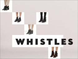
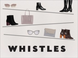
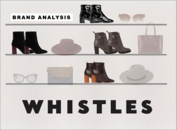
You can view our final AW15 Trend Brief – Brand Analysis presentation above ^^
Warning: this post will be a lengthy one. 🙂
After the three tasks (you can read about them here!), we were immediately briefed on the next and final one – BRAND ANALYSIS PRESENTATION.
Now, it was still part of the overarching AW15 Trend Brief, but this one we got a formative feedback and grade, meaning an indication of current performance only and won’t necessarily count but it’s the end result of all the other ‘practice’ presentations and research.
This task was still completed in our groups, which I was really glad as I got lucky and was put in a group with two very lovely girls who actually put in a lot of work and we all contributed equally. Anyway, we had to critically analyze one brand of our choice. Our lecturers told us it would be better if we chose a brand that has a clear identity/values and a coherent target consumer. Alongside the PowerPoint, we also had to hand in team diary (to keep evidence/track of who’s present in meetings etc.), Harvard references (the first time I’ve done this – #unilife) and also a sketchbook (not compulsory).
Within the PowerPoint, we had to answer four specific questions:
- How did the brand interpret & communicate the predicted trends?
- How did the brand adapt the trends for their target consumers?
- How did the brand ensure that the trends remained true to its brand values / identity?
- How successful was it?
And then –
Visualise how you would improve their marketing mix offer (add or change)
I just thought of doing a diary form here to make it easier to discuss aspects in preparation for the task.
Thursday
The day we got briefed on this task straight after Task 3 presentation.
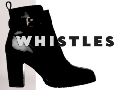
We decided to go with WHISTLES, but we were also thinking of MARKS & SPENCERS. WHISTLES won in the end as we thought they were a ‘quiet’ brand and upon quickly looking online, they weren’t promoting their footwear (boots) as much as they publicize their other products. So we thought we could do a lot more for that brand, and we thought they had a clear target consumer too.
Friday and Saturday
As we don’t have lectures on Friday, all members spent the weekend researching online as much as we could find about the brand, its principles, its history and values. We also looked at their promotional campaigns and social network platforms.
Sunday
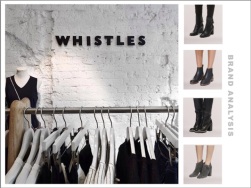
A member and myself went to visit WHISTLES in their Nottingham store to ask questions. We actually spoke with the store manager, who was lovely enough to answer any questions we had! Thank God she was nice enough and not snobby like other stores (ahem Flannels) and we asked her retail and positioning, how they display products, the factors that go into visual merchandising, and I asked her questions specifically about footwear and the four questions. We got out of the store feeling really pleased with ourselves.
Monday
We booked a table in the library, which was really nice and useful, and a place we could concentrate and discuss ideas in. We started the PowerPoint on our macbooks, and we decided on the order of the slides. We showed each other what we achieved during the weekend ie. Research and I also showed them layout ideas I played around with on the weekend and I was glad that both my group members were really happy and incorporated it onto the powerpoint. We also discussed what we were going to wear, we wanted to present the Whistles brand through our clothing too.
Tuesday
Straight after our lecture, we went straight to our booked private room. I must say I love the library rooms as I felt really mature and a professional whenever I’m inside them. Ha. Anyway, one member showed the development of the sketchbook we were planning to show the lecturers that comprised of creative inspirations and the process. We started the Harvard referencing, I needed help with this as I’ve never done it before and my other group members helped me. We also had to finalise the idea of our visual marketing mix. We wanted something that wasn’t too safe but at the same time, wasn’t too risky. Below is the basic idea of it, as the actual PowerPoint didn’t have any notes to explain.
VISUAL MARKETING MIX IDEA
-Visualise how you would improve their marketing mix offer (add or change-
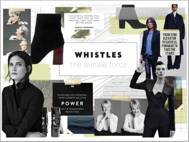
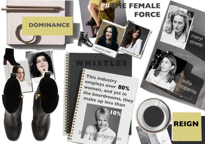
(our two mood boards – I created the second one)
As proven by our research, the product, place and price of Whistles are already effective.
However, they are lacking in promotion. They advertise their other products (knitwear, dresses etc.) but they are lacking in the footwear department on any platforms apart from social media. Their current lookbook only had one photograph of a pair of boots.
So we introduced ‘The Female Force’.
A lookbook that focuses primarily on boots. However we incorporate the idea of ‘Power’ and ‘Confidence’.
Within the lookbook, we will also use successful women who are well established in their industries as models for footwear. We will also include articles/profiles of them explaining how they became achieved success. This will then inspire younger professionals who are also part of Whistles target consumer.
The CEO of Whistles, Jane Shepherson, said that “this industry employs over 80% women, yet in the boardroom, they make up less than 10%”. This campaign will then hopefully motivate women to be stronger in such a male dominated industry.
We could also incorporate social media into this campaign. By using Twitter (with our hashtag #TheFemaleForce), we could interact with audience and engage with younger professionals in the creative industry that has social media platforms.
Wednesday (the day before!)
Just like the day before, we booked a room and rehearsed multiple times. We actually timed ourselves (can’t go over 12mins) and stood up as if we’re actually presenting in front of people already. We also showed what we did created the night before in terms of our visual marketing mix idea – moodboards. Turns out we had two finished moodboards and we eventually ended up including both in the final presentation. We had to remember body language (can’t look bored while another member is talking and we can’t read from the screen) and make sure we get our message across. During the evening, the group and myself were still sending emails to each other, tweaking small details and also printing Harvard references, team diaries and sketchbook sorted.
AFTER PRESENTATION
We got a HIGH 2.1! Below is the summary of our feedback as group!
Context
+ Good range of sources
+ Strong summaries
-Try to use wider range of sources not just the brand’s website.
-More analytical of the trends, describe them in more depth
-State how the social media platforms relate to the target consumer
Creative Concept
+ Good how we used multiple quotes
-Question the ideals of the brand in terms of their target consumer and be careful how you interpret the brand’s information.
-Reflect the brand identity how it is more high street/middle market than high end.
-Speak to the customers in the store to see their personality.
Big idea
+ Relevant and creative idea. It relates to what was going on at the moment
+ Good language of ‘The Female Force’ – the lecturer said it’s one of our strongest points as we were the only group to create a concept and a mood board plus naming it and explaining the idea behind it
+ Moodboard interpreted the brand’s aesthetics and style
-More key words to describe the visuals to highlight the concept
-Needed more research into the concept of the idea.
Execution
+ PowerPoint presentation visuals
+ Good visuals – Presentation and moodboard
+ Sketchbook represented the brand well – ‘looked like a Whistles sketchbook’
+ Good structure of the powerpoint, gone through the stages and responded to the questions.
+ Brilliantly branded the presentation
– State the author and date of the quotes used
Autonomy
+ Very well presentation, one of our strongest points
–
MOCK UPS
I also just want to include mock ups and different design/layout ideas that ultimately didn’t make it to our final PowerPoint. I’m more proud of this presentation not only because it was the final one but because out of all three presentations with the group, this was my most heavily contribution in terms of design and visuals. I enjoyed playing around and experimenting with the design aspect so much!
I’m not just posting about this for the sake of it, of course it’s good to show the result of our hard work and knowledge, but I’m also doing this for myself – in a few years time, I’d like to go back to my small personal uni blog and remember what I did during first, second, third year. I can see my progress and I’d be like ‘oh I remember that!’, it will bring back so many memories and hopefully I’d have learnt a lot by then!
